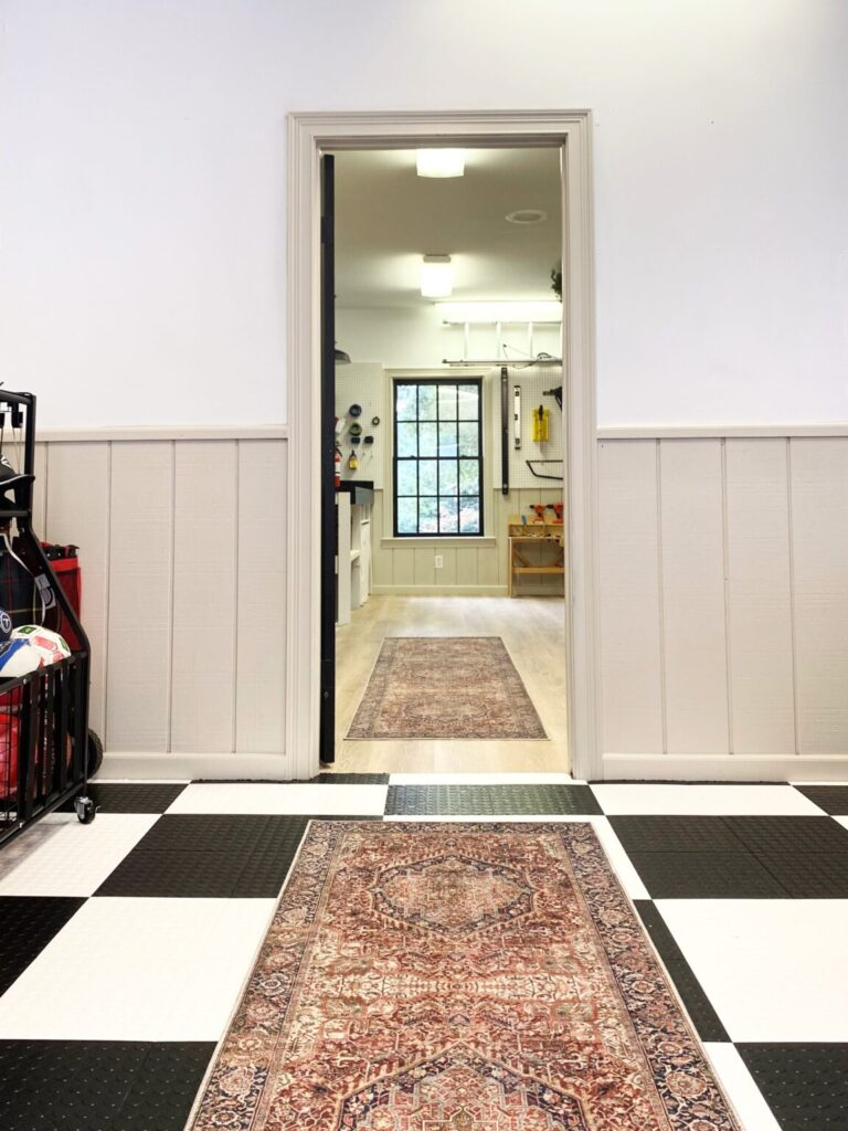
How It Looks on Our Trim (And Why I Love It!)
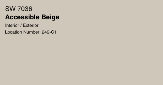
When it comes to tried-and-true neutral paint colors, Sherwin-Williams Accessible Beige SW 7036 is always in the conversation. It’s versatile, timeless, and—despite its name—not your average beige.
I recently used Accessible Beige on our trim in the Monarch Revival garage, and it completely transformed the space. Today, I’m sharing exactly how this color looks in real life, what makes it special, and tips for making it work in your home.
What Makes Sherwin-Williams Accessible Beige So Popular?
Accessible Beige has a loyal following for a reason—it’s the perfect bridge between warm beige and modern gray. Instead of leaning too yellow (like old-school beige) or too cold (like some grays), it’s a warm neutral that feels cozy but still fresh.
Here’s why I think it’s so loved:
- Works in almost any lighting — adapts beautifully from warm natural light to cool artificial light.
- Pairs with nearly any color palette — works with whites, blacks, deep colors, and other neutrals.
- Timeless but not boring — its subtle undertones keep it looking fresh year after year.
Its versatility makes it work well for a variety of interior styles from modern to traditional (and even grandmillennial).
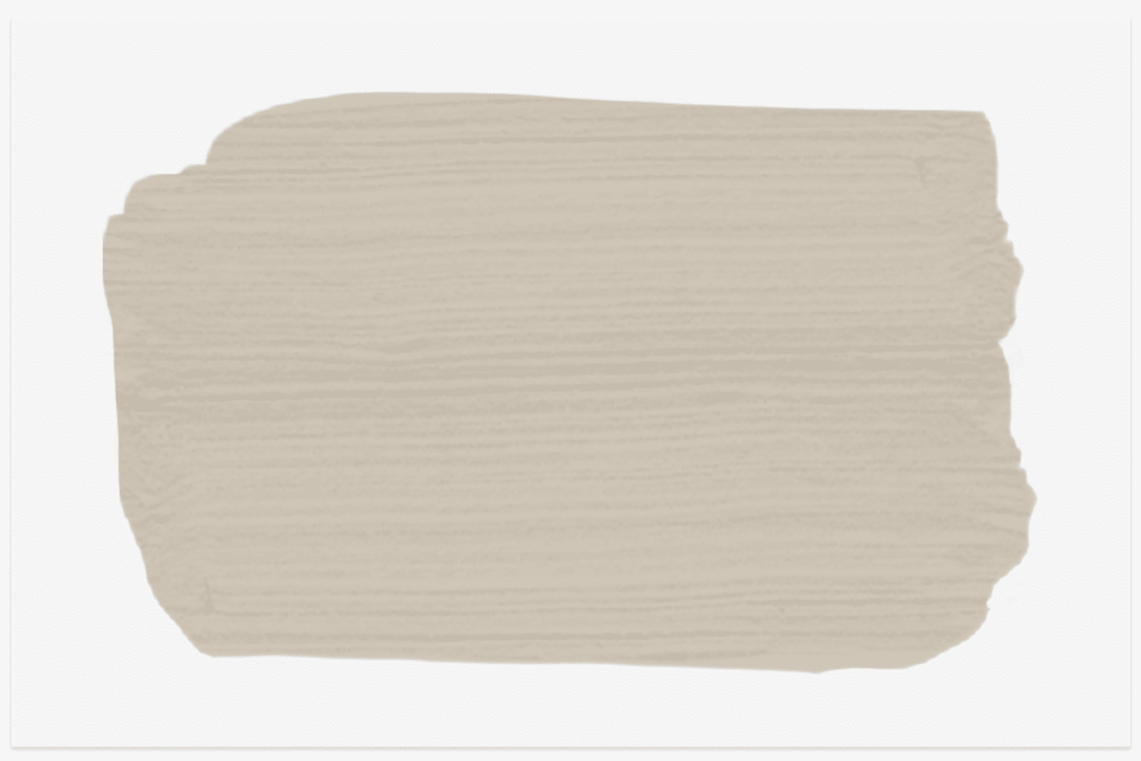
Sherwin-Williams Accessible Beige Undertones
This paint color is considered a warm greige—that magical mix of gray and beige. The gray undertone keeps it from feeling yellow or pink, while the warmth makes it more inviting than a pure gray.
- In warm lighting: Looks more beige and cozy.
- In cool lighting: Leans more gray and sophisticated.
Tip: Always test a sample in your space before committing—lighting makes a huge difference.
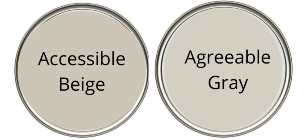
Accessible Beige vs. Agreeable Gray
You can’t discuss Sherwin-Williams Accessible Beige without talking about its cousin, Agreeable Gray. While both colors are popular for good reason, they each serve different purposes. If you’re torn between the two, here’s the quick breakdown:
- Accessible Beige: Warmer, cozier, great for traditional or transitional spaces.
- Agreeable Gray: Cooler, more modern, better for crisp, contemporary interiors. If you’re curious to see more really beautiful colors in this gray-beige spectrum, read my post: All About Greige.
Best Colors to Pair With Accessible Beige
- Crisp white trim — Sherwin-Williams Pure White or Alabaster for a classic look.
- Charcoal or black — adds drama and modern contrast.
- Other warm neutrals — taupe, mushroom, or greige tones for a seamless palette.
- Accent colors — muted greens, dusty blues, or navy for a pop of color. Learn how to choose the perfect shade here.
Where to Use Sherwin-Williams Accessible Beige

One of the reasons I love Accessible Beige is that it works anywhere:
- Trim and millwork (like in our garage!)
- Kitchen cabinets
- Bedroom or living room walls
- Exterior siding or shutters
In our Monarch Revival garage, I used Accessible Beige as a neutral accent on vertical shiplap trim. Against the black-and-white garage tiles, the warmth really softens the space—proof that even a garage can feel inviting.
How to Get Sherwin-Williams Accessible Beige in Any Brand
You can ask any paint store to color-match Sherwin-Williams Accessible Beige SW 7036 into the brand and finish you prefer. For trim, I typically opt for a semi-gloss finish for its durability and ease of cleaning.
Sherwin-Williams Accessible Beige isn’t just “another beige.” It’s a modern, adaptable neutral that works in any space, on any surface, in any style home.
If you’re hunting for a paint color that’s warm but not yellow, gray but not cold, and timeless without being bland—this one’s a winner.
Do you have a go-to paint color you love? Let me know in the comments! And to keep up with all the latest on the blog, check out my recent posts:
Leave a Reply