When renovating a home as iconic as our colonial-style house, each design decision is an opportunity to infuse character and charm. Paint colors, in particular, play a huge role in defining the personality of each room. The Monarch Colonial Renovation is no exception—and I really wanted to challenge myself to create a specific vibe for each space in my home.
Today on the blog, I’ll walk you through how I chose the perfect color for each space, the inspiration behind these choices, and what each shade brings to the room. From calming neutrals to bold statements, hopefully, these shades help you find inspiration for paint color ideas in your home!
Primary Bedroom: Sherwin Williams Velvety Chestnut

Why This Color?
To me, the primary bedroom has a very specific vibe—warm, inviting, and serene. Sherwin Williams Velvety Chestnut delivers all that and more without coming off as too overwhelming. This rich, deep brown has undertones of auburn, which bring an understated elegance while keeping the space cozy.
After seeing Velvety Chestnut on the walls of our primary bedroom, I extended it out into the hallway leading to our primary door, which created extra elegance. If you ever have the chance to add extra drama like this – I highly recommend!
The Look and Feel
Velvety Chestnut reads like a warmer tone, without coming off as too warm. It’s the perfect paint color idea for creating a calming space that a bedroom needs, while still feeling sophisticated. Paired with cream-colored bedding and brass accents, it’s the perfect color to elevate while still complimenting the rest of the space.
Primary Bathroom: Sherwin Williams Pure White
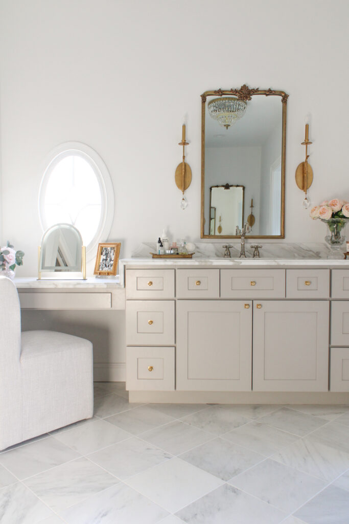

Why This Color?
After the warmth of the bedroom, I wanted the bathroom to feel fresh and rejuvenating. Sherwin Williams Pure White creates a crisp, clean atmosphere that highlights natural light. When you think of the perfect white paint color – this is it. I love this color SO much, it’s in several rooms of my house both now and in the past homes we’ve redesigned.
The Look and Feel
This neutral white has soft undertones that avoid feeling sterile. It’s a classic choice that complements marble tiles, silver or brass fixtures, and natural wood tones beautifully. I highly recommend this color for an instant spa-like vibe within your own home.
Living Room: Benjamin Moore Trailing Vines

Why This Color?
The living room is a space that’s all about comfort, so I really wanted to lean into this feel with a bolder, moodier choice: Benjamin Moore’s Trailing Vines. This deep, earthy green anchors the room with a sense of calm, without coming off as too much for a space you sit in so frequently. After seeing A Glass of Bovino use it in her home, I knew I just HAD to use it somewhere special.
The Look and Feel
This color transforms the space into such a cozy atmosphere. Its rich forest green tone feels luxurious yet inviting, especially when paired with neutral furniture, gold accents, and natural textures like wood and woven baskets.
Kitchen: Sherwin Williams Pure White

Why This Color?
Can you tell I always fall back on Sherwin Williams Pure White when I need a dependable crisp color? To me, the perfect paint color in kitchens bring out brightness and functionality, and this shade checks all the boxes. Its versatility ensures it blends seamlessly with the bold and neutral elements in the open floor plan, which was one of my top considerations.
The Look and Feel
This shade creates a clean, timeless backdrop for the kitchen’s standout features, like a waterfall island or polished hardware in my case. It also allows the surrounding decor to shine without competing for attention. To see all my thoughts when designing our kitchen, check out my post: Kitchen Remodel Ideas: How To Decide What To Keep vs Change!
Movie Theater: Behr Carbon

Why This Color?
Although I always tend to lean towards lighter colors, a movie theater room calls for something bold and dramatic. Behr Carbon delivers the perfect balance of depth and sophistication with its nearly black hue, without coming off as a dark hole. To me, it sets the stage for a true cinematic experience.
This is not my first time using Carbon – it’s been in every theater we’ve had! With one coat it’s a dark grey, but the second coat is the perfect black. If you feel yourself drawn to paint a space in your home dark, you cannot go wrong with this moody shade.
The Look and Feel
Behr Carbon creates the ultimate moody, intimate vibe—ideal for a cozy night in. Pair it with plush seating, dimmable sconces, and cozier elements to act as contrast.
Piano Room: Sherwin Williams Lullaby
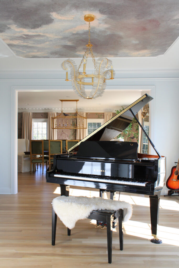
Why This Color?
When it was finally time to bring the piano back into our home, I wanted this space to feel really light and ethereal. I had dreamed of putting up a ceiling mural, so I needed the color to complement without taking away focus as well. Sherwin Williams Lullaby, a soft blue-gray, hits the right note by bringing a calming energy to the space.
The Look and Feel
This delicate color feels airy and inspiring, making it the perfect backdrop for creativity. I highly recommend pairing this shade with color! It pulls out warmer tones without coming off as too loud.
Older Boys’ Room: Behr Submarine Gray

Why This Color?
For the older boys’ room, I wanted a color that balanced their maturity while still being youthful in the overall vibe. Behr Submarine Gray’s cool undertones give it a fresh, modern feel without coming off as too grown-up. This is one of my favorite shades in the renovation and I hope it may strike a chord for anyone looking at paint color ideas too!
The Look and Feel
This medium gray pairs beautifully with lighter bedding, warm wood tones, and nods to American history (a time period my oldests love to learn about). Best of all, it’s durable enough to grow with them through the years.
Younger Boys’ Room: Benjamin Moore Caldwell Green
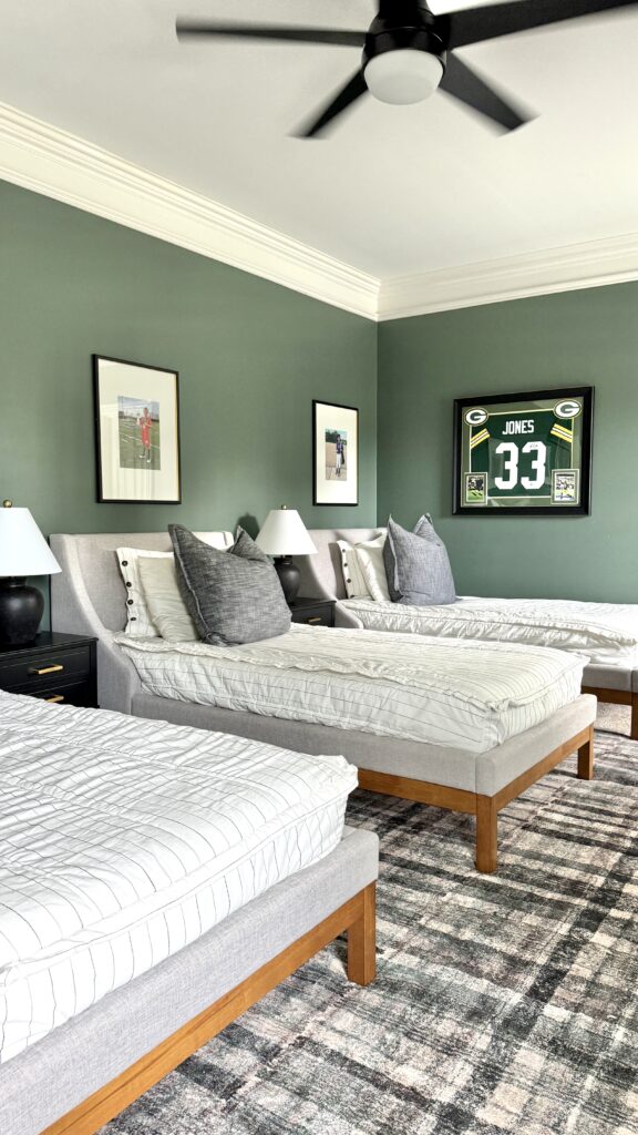
Why This Color?
Benjamin Moore Caldwell Green offers the perfect mix of energy and sophistication for the younger boys’ room. Its vibrant green tone feels playful but grounded, plus it gives a nod to the Green Bay Packers green color we love so much in our house.
The Look and Feel
This shade adds personality and charm, especially when paired with natural wood furniture and bright white accents. It’s the perfect color to grow with boys, especially if they are younger and still want a room of color.
Exterior: Sherwin Williams Greek Villa & Benjamin Moore Boothbay Gray

Why These Colors?
For the exterior, cohesion is key to ensure you like the look of what you drive home to for years to come. Sherwin Williams Greek Villa, a warm white, serves as the base, while Benjamin Moore Boothbay Gray adds dimension as an accent color on shutters and doors.
The Look and Feel
The combination exudes timeless colonial charm. The soft white feels fresh and inviting, while the muted gray accents tie the look together with a hint of subtle sophistication.
Choosing The Right Paint Color Is All About Your Intention For The Space
No matter the space you’re thinking of painting (or re-painting), I highly recommend starting with how you want the space to feel before deciding on a color. When you consider the mood, it creates a foundation for a cohesive design that tells a story.
Selecting paint colors for the Monarch Colonial Renovation is about more than aesthetics, but how to make a space feel special. Each color was chosen with intention, reflecting the purpose and mood I wanted the space to convey. From calming blues to dramatic greens, these hues create a cohesive yet dynamic palette that breathes new life into this home.
Did any of the colors I chose give you paint color ideas for your home? Let me know in the comments! And as always, check out my previous posts for more renovation tips and reveals:
Leave a Reply