Coordination within a room is one of the best ways to create an elevated and cohesive look. It took years to develop an eye for blending contrast elements together, and I learned the easiest way is through color. Although it sounds quite complex to create the perfect paint shade, it’s simpler than you think, just the magic of color matching.
Today on the blog, I’ll be chatting all about paint color matching! This is the trick I’ve used in countless rooms in my home, but also a crucial part to the development of my Monarch Home wallpaper line.
The Basics Of Paint Color Matching
So what is paint color matching exactly? One of the easiest home design projects you’ll ever take on! With all the technology available to hardware stores nowadays, they are able to create the exact shade of the color you want- all you have to do is ask.
Let’s say you have a really specific color in mind (maybe one of the Monarch Home coordinating colors), there are a few paths you can go down:
- Name lookup
- Hex code matching
- App color scanning
If you’re after a popular color, modern hardware stores can look it up by name alone and mix it with whatever brand/finish you want. Some hardware stores don’t have this capability, but they can perfectly match it using the unique hex code. See a color in person, but don’t know the name or hex code? Scan it on a paint color matching app!
What Is A Hex Code?
If you just read hex code color matching and got confused, you’re not alone. Until I started learning about paint matching I had no idea what this was. To put it simply, a hex code is the key behind paint color matching. They are digital codes that create a universal color language to make sure the exact shade and hue is identical in any form.

All paint brands label their shades with hex code numbers, making the matching process extremely easy for both you and hardware stores.
Monarch Home Paint Color Matching
When creating Monarch Home, color was a really essential part in developing each wallpaper print. I wanted to create patterns rich in color so dimension would draw the eye to it easily. This was not the easiest process, as you can imagine, because I had to walk a fine line between finding paint colors I love and developing coordinating palettes of my own.
I’m really proud to say I’ve developed a completely coordinating line of wallpapers and paint colors! When Monarch Home is available to you all, there will be a coordinating palette of paint shades (with both name and hex code) from Sherwin Williams.
Now, you can develop a space that perfectly coordinates with whatever paint brand and finish you love.
Completing A Space With Coordinating Colors
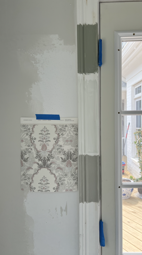
To test my wallpaper and paint color matching prowess in a real space, I used our pool house as the first subject. Although there are a lot of things still in the works, the Ryleigh wallpaper is finished and made the perfect pop of color for this fun space.
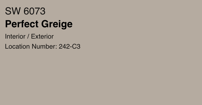
I debated between a few of the colors in the print, but eventually settled on highlighting the stunning neutral green shade that just so happened to be the 2022 color of the year. To learn all about this gorgeous color, click here.

Through paint color matching, I was able to get an exact replica of the rich green in the Ryleigh wallpaper to paint my trim. It was absolutely incredible to see my wallpaper vision come to life and I cannot wait to share more details with you all soon.
Have you ever used paint color matching before? Let me know in the comments! And to keep up with all things on the blog, check out my latest posts:
Leave a Reply