If you’ve been following the blog for a while, you know I’m not one to follow a trend. As I’ve grown in my own design taste and shared it with you all, I’ve really solidified my confidence in trusting my gut and going for it. When it comes to color popularity, a lot of times it’s a big guessing game. Although both influencers and big brands alike try to predict what colors will take over, I find it way more fun to throw caution to the wind and pick a color that speaks to you. That being said, Color of The Year choices are some of my favorite design press to read about.
Today on the blog, I want to talk all about the 2024 Color(s) Of The Year and what this means for design trends we will see coming soon. Most importantly, I want to share the fun around embracing colors you’re not as used to.
What Is “Color of The Year”?
The Color of the Year is basically the most famous shade in the design world – it’s a hue that sets the tone for everything creative that year. This color may seem super random, but there’s a ton of research going in behind the scenes to make the final choice. Color experts (isn’t that the coolest job you’ve heard of) try to capture the current cultural and social trends and funnel it into a specific shade. While this can sound a bit complicated, it’s really cool to look back and see what colors define the past few years.
Why Are There So Many Colors?
So if color experts do so much research to choose the right color, why does every major color/paint brand have a different color that are all so different? I’ve asked myself this so many times.
Each brand does their own sort of trend analysis and consumer studies, but also use their own intuition on what’s popular with their customers. Although there is no true color that will 100% define 2024, I like to think of it as a fun glimpse into the year ahead and see what color I gravitate towards the most.
2024 Color Of The Year By Brand:
Pantone – Peach Fuzz

Pantone, one of the top brands you think of when it comes to color, has chosen a bolder choice of “Peach Fuzz” as its Color of the Year. This soft, peachy hue brings a sense of comfort and warmth to any space. I’d classify this as a true light peach, not too orange, but just enough to get that sense of fun in your space. While this color isn’t typically my style, the charm of Peach Fuzz is starting to grow on me.
Sherwin Williams – Upward

In the complete opposite direction, Sherwin Williams embraces a cooler, deeper shade with their choice of “Upward” as the Color of the Year. I’d classify this as calming and neutral blue, but with a bit of sophistication behind it. I’ve used a color like this in my Billiard Room and absolutely love it, so I could see this option in bedrooms, bathrooms, or spaces that you want to add an extra pop.
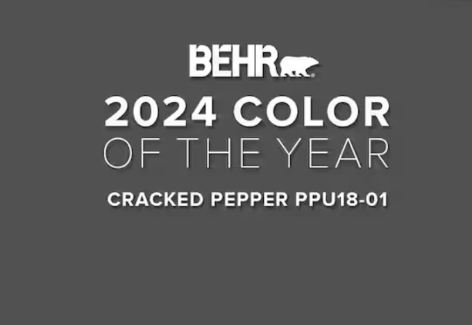
Behr – Cracked Pepper

Of all the colors on this list, Behr has chosen the most dramatic shade with “Cracked Pepper” as its Color of the Year. This is a rich, charcoal black that will definitely add a touch of elegance and moodiness to your space. Cracked Pepper is a color that needs to be used very carefully. The shade still has a bit of warmth to it, but be careful to use it sparingly so it doesn’t suck the life out of your room.
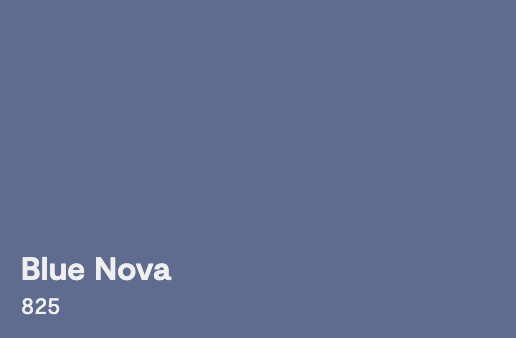
Benjamin Moore – Blue Nova

We have another blue on the list! Benjamin Moore chooses to go with a slightly brighter blue called “Blue Nova” as its Color of the Year. I’d describe this blue as a really interesting mix of both calm and excitement, making it an excellent choice for bedrooms and living areas. I don’t know how my classic heart could tackle Blue Nova, but for the design lovers who enjoy a pop this is for you.
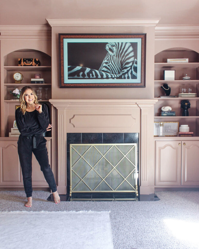
Mallory Nikolaus – SHerwin Williams Velvety Chestnut

Although I’ve done absolutely no consumer research, and I’m definitely not a color expert, I wanted to jump in on the fun and pick a Mallory Nikolaus / Monarch Home color for 2024. Color is something I choose really strategically within each room of my home, so my recommendation is one that I continue to fall in love with each time I look at it.
Mauve really appealed to me a lot in the second half of 2023 and I see it growing even more in popularity in the coming year. After painting my primary bedroom in this gorgeous cool-toned pinky-purple, specifically called Sherwin Williams Velvety Chestnut, I knew without a doubt it had to be included in multiple variations in my home.

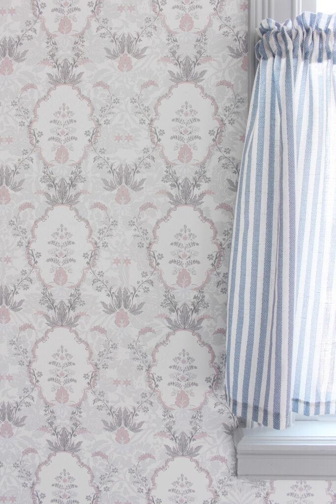
Since I try to never do the exact same design twice, I had this same idea with mauve. Monarch Home has been in the works for a while, so incorporating mauvey pinky purpley tones to each unique print felt like the perfect idea. To see the Monarch Home wallpapers, click here.
I truly see this color becoming the it-girl of 2024. I love how it can act as a neutral with cool tones, yet the bit of pink within adds that warmth that makes your space feel like a home. Regardless of how many people use it, I know I’ll love it for years to come.
2024 Color Of The Year: Wrap Up
I hope you loved looking at the 2024 Color(s) Of The Year as much as I did! It’s really interesting to see how such different shades can really inspire design around us. I personally have had so much fun leaning into various color trends over the years, but there’s something about the classic neutral palette I can’t fully part with.
What is your favorite Color Of The Year on this list? Let me know in the comments! And to keep up with everything on the blog, check out my recent posts:
Leave a Reply